Hey, Seymour! Behind the Scenes: A Make-Your-Own Space Adventure
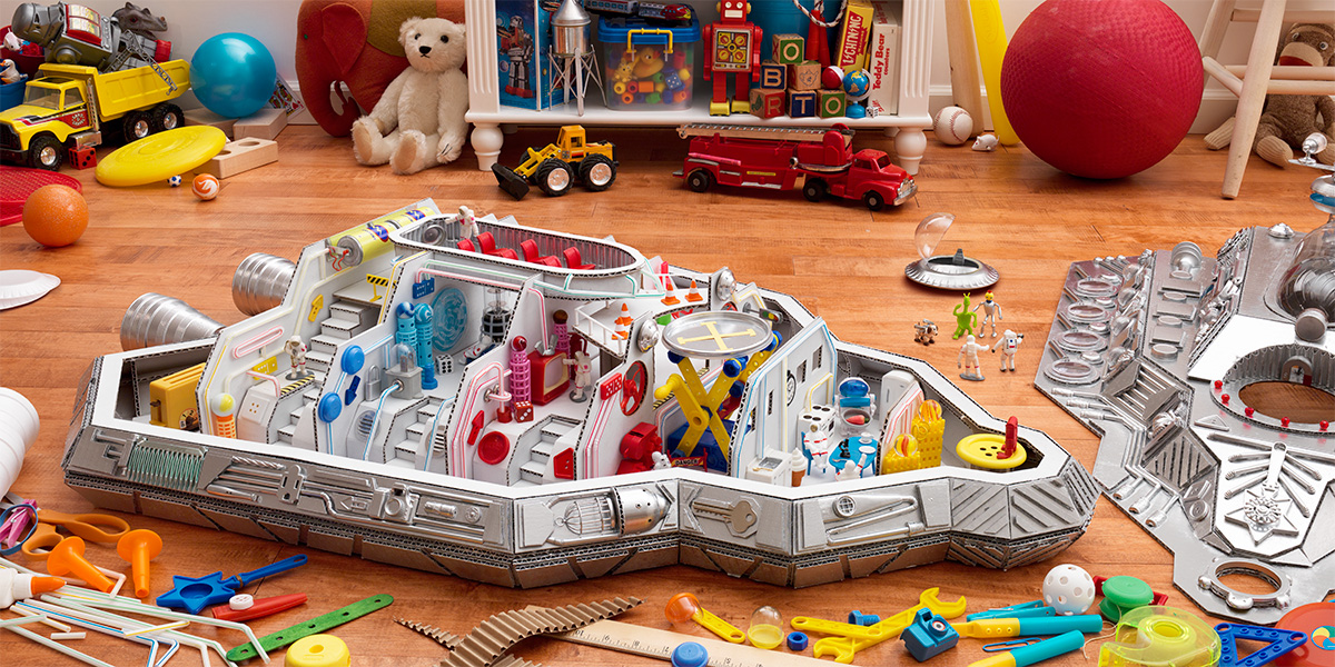
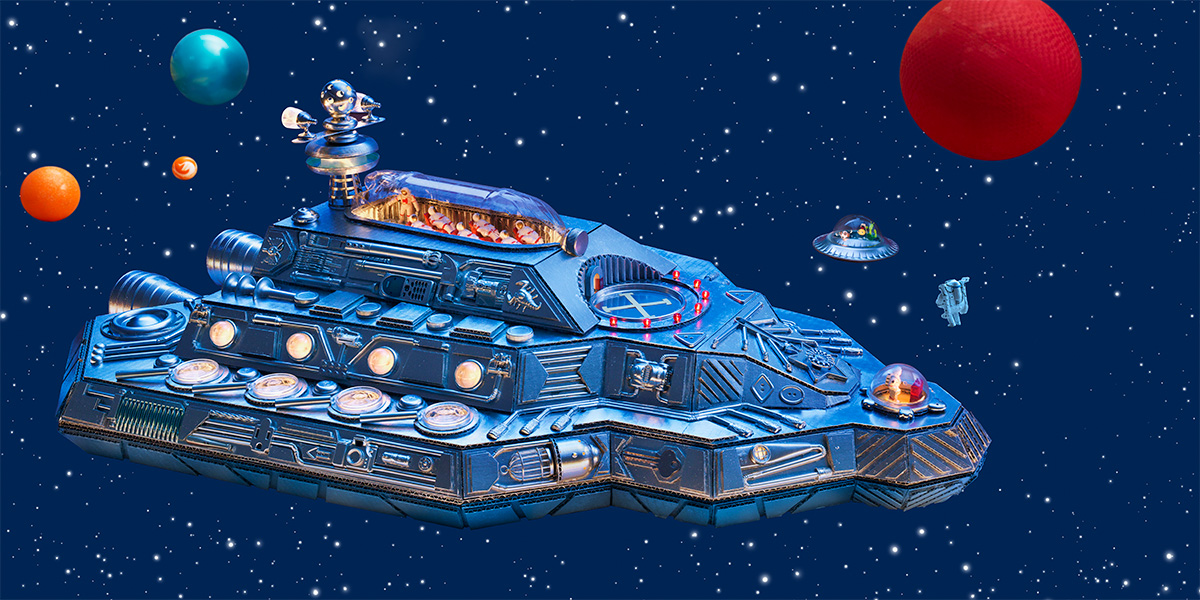
Sketches are a quick way to explore concept, color, and composition. For this two-picture sequence, I envisioned a home-crafted spaceship on a Space Adventure (above left), and the same ship returned home in Safe Landing (above right), where the top has been popped off to reveal a dollhouse-like interior.
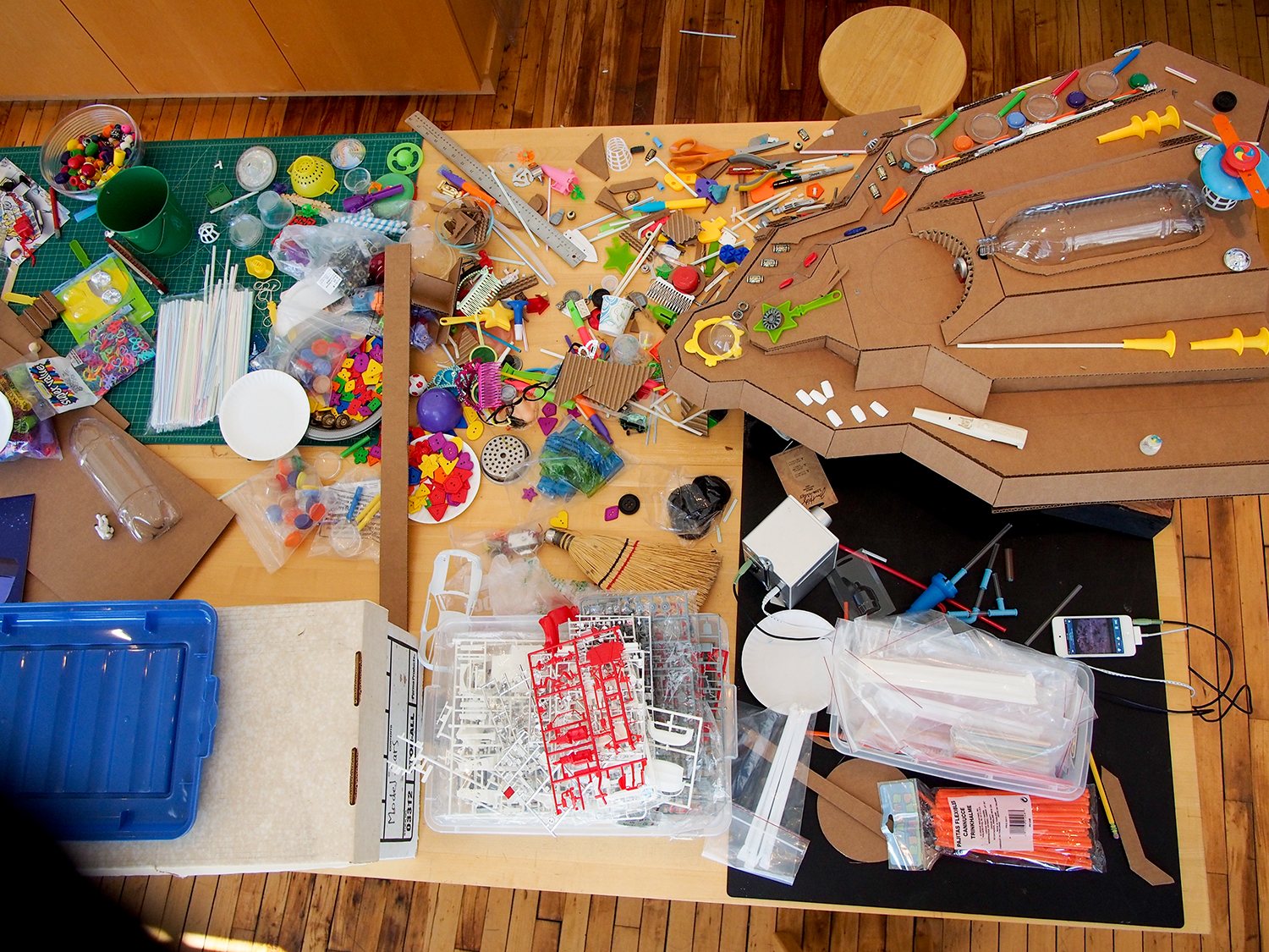
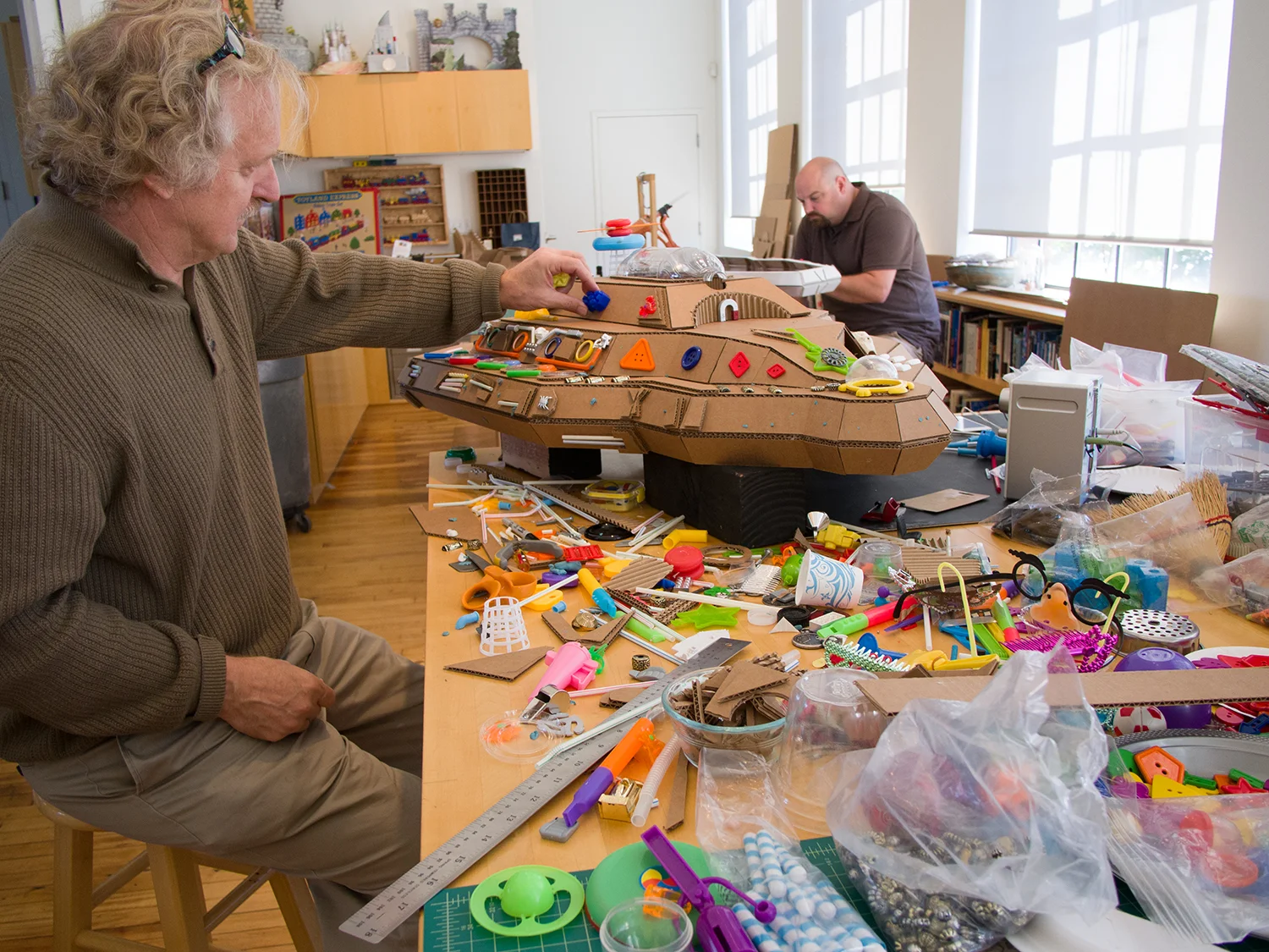
True to the spirit of do-it-yourself toy making, the ship was made of cardboard and detailed with salvaged party favors, recycled toy parts, a plastic water bottle, bits of hardware, and other odds and ends.
The outer form of the ship was guided by my sketch, but the details were worked out by trial and error – a process of mixing and matching elements in search of a design befitting a high-tech, functioning spaceship. The model I'm working on above is a stand-in for the final version seen in the background being prepared for painting by studio manager, Dan Helt.
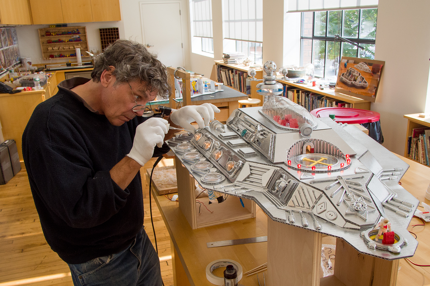
Artist Randy Gilman carefully attaches final details (above). Silver spray paint gave the ship a high tech sheen and unified what would otherwise have been a riot of mis-matched colors, textures and materials. Numerous miniature lights illuminated the ship's water bottle skylight and magnifying glass portholes.
The room depicted in Safe Landing, is in fact a 2ft high stage covered with floor boards with only enough wall and baseboard required for the photograph. The elevated stage makes arranging and lighting more convenient and keeps the set safe from general foot traffic in the studio. As chaotic and messy as the set looks (above), it is in fact carefully arranged to support the story, provide nooks and crannies for hidden objects, and keep the eye moving around to all corners of the picture. While arranging the set and photography took only a few days, the spaceship took a few weeks to build.
Click and drag the center line (above) to the right to see Space Adventure, then left to see Safe Landing. The additional fold-outs that reveal the text in each spread are not shown here, but we can see how the two pictures provide a study in contrasts: cool and warm; exterior and interior; outer space and inside the home; fantasy and reality. Photoshop was used to create the star field background and change color tints of Space Adventure, but otherwise, the common elements in both pictures were shot on the same stage.
Space Adventure & Safe Landing ©2015 Walter Wick,
from Hey, Seymour!



Written and Photographed By Walter Wick
Scholastic / Fall 2015
32 Pages / Hardcover
Ages 3-5 years