"How did you do that?" was once a typical question from readers confronted with a frequent motif of mine: toys seemingly caught on camera in mid flight. "Did you drop the toys and take a quick picture?" was one suggested solution. Recently, a long-time fan, having seen how intricate my film era process was for creating Yikes! (above) asked, "Is there an easier way to make objects appear to float?" I can safely assume the questioner was thinking of the new age of digital tools.
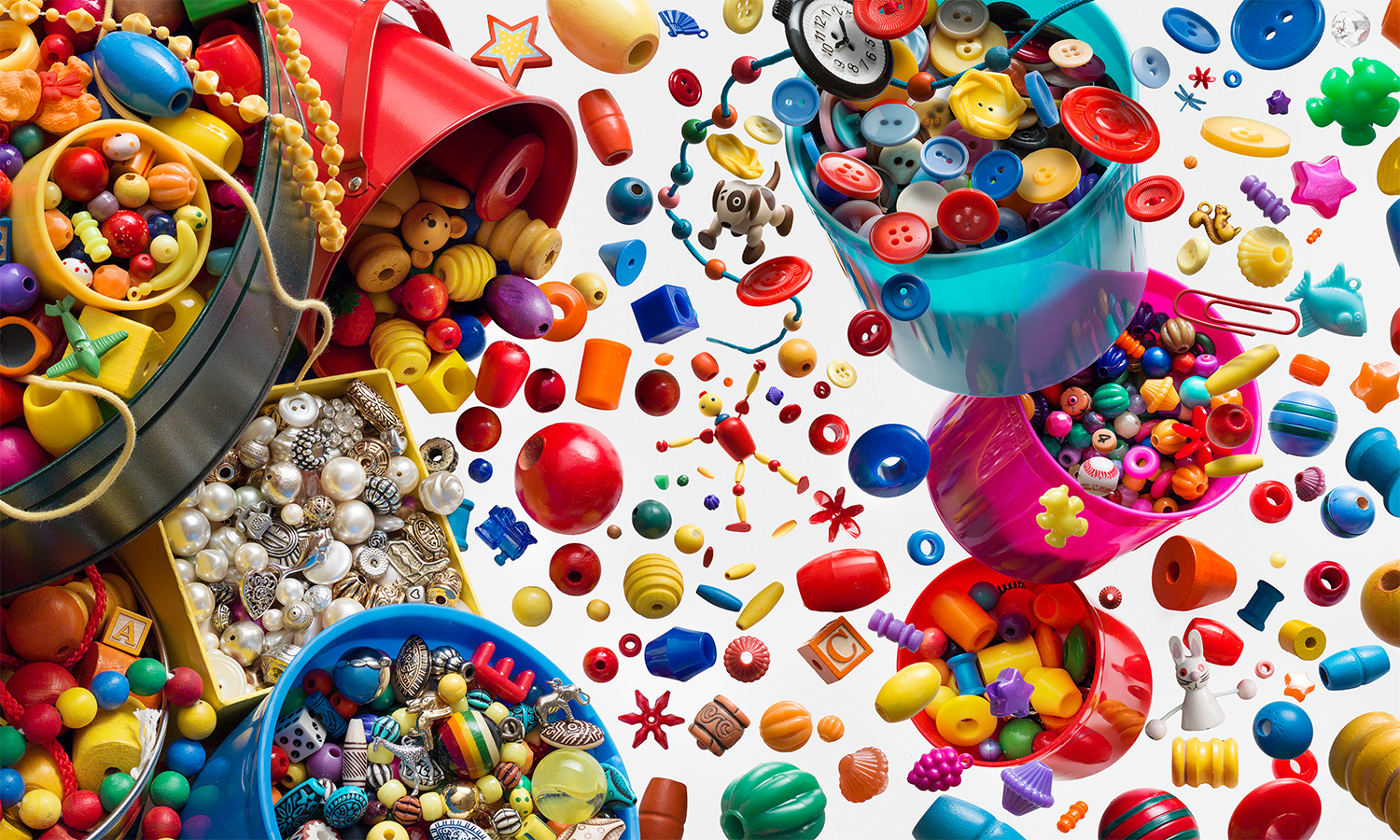
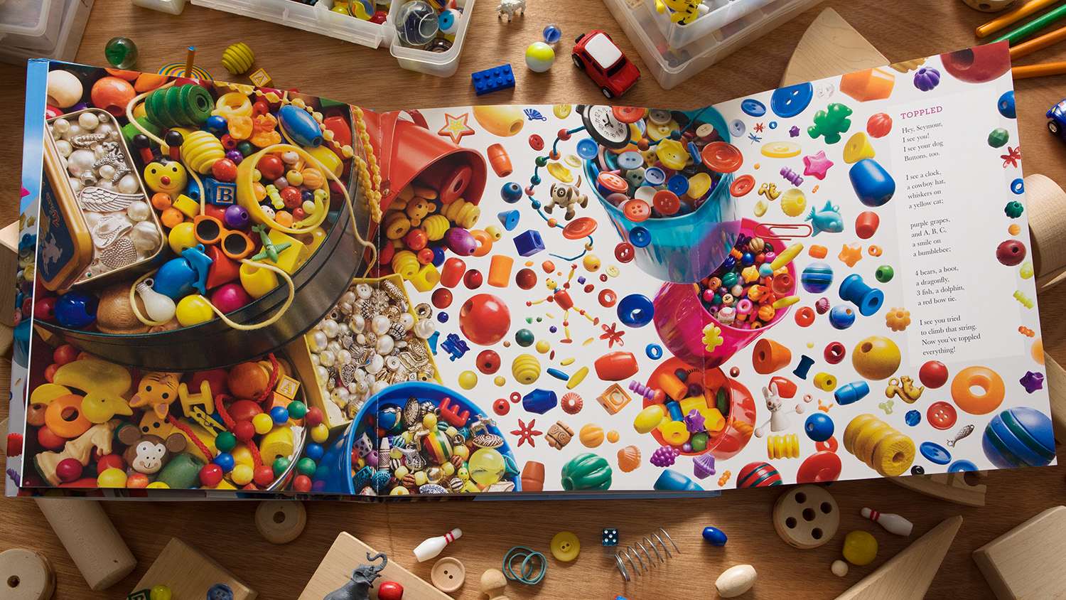
Toppled (part 2) from Hey Seymour ©2015 Walter Wick
As much as I've labored for years using "in-camera" techniques (the term for un-retouched film photos), I've been fully digital since 2004, employing high resolution cameras and powerful editing programs like Photoshop. Perhaps it's time to address the question of film vs. digital effects. In doing so, I'll compare the film-era Yikes! from I Spy Fantasy (1994), and the digitally captured Toppled, from Hey Seymour! (2015).
50 megapixel digital camera (far left) with 8X10 film camera; Ektachrome T64 transparency film.
Above are the two cameras in question: The 50 megapixel medium format digital camera (left) used for Hey, Seymour! (2015), and the 8X10 view camera I used in the film era. At right is the original film of Yikes!. The I Spy series, produced in the 1990's, were all shot with large format film cameras. The vast majority of those images, includingYikes!, were sent to the printer without any post production retouching.
On set of Yikes!, and Polaroids used to preview the progress, 1993
Yikes! began with an idea to make a dream-like image of gravity-defying toys. Wanting an appropriate ground for the geometric block components, I choose a checkerboard pattern, painted in "forced perspective" to create an illusion of depth greater than is actually in the scene. This had the added benefit of keeping the floor from extending too far away from the camera so everything could remain in focus. Next, to create the cartwheeling robot-like figures, I experimented with arranging blocks on a table, recording the designs with SX-70 Polaroids (above right). With the figures worked out, I could begin to anchor them to a vertical sheet of clear glass using hot melt glue and adhesive putty. The three larger Polaroids were made using an adapter in the film camera. In this way I could "instantly" check what the camera was seeing as the composition progressed.
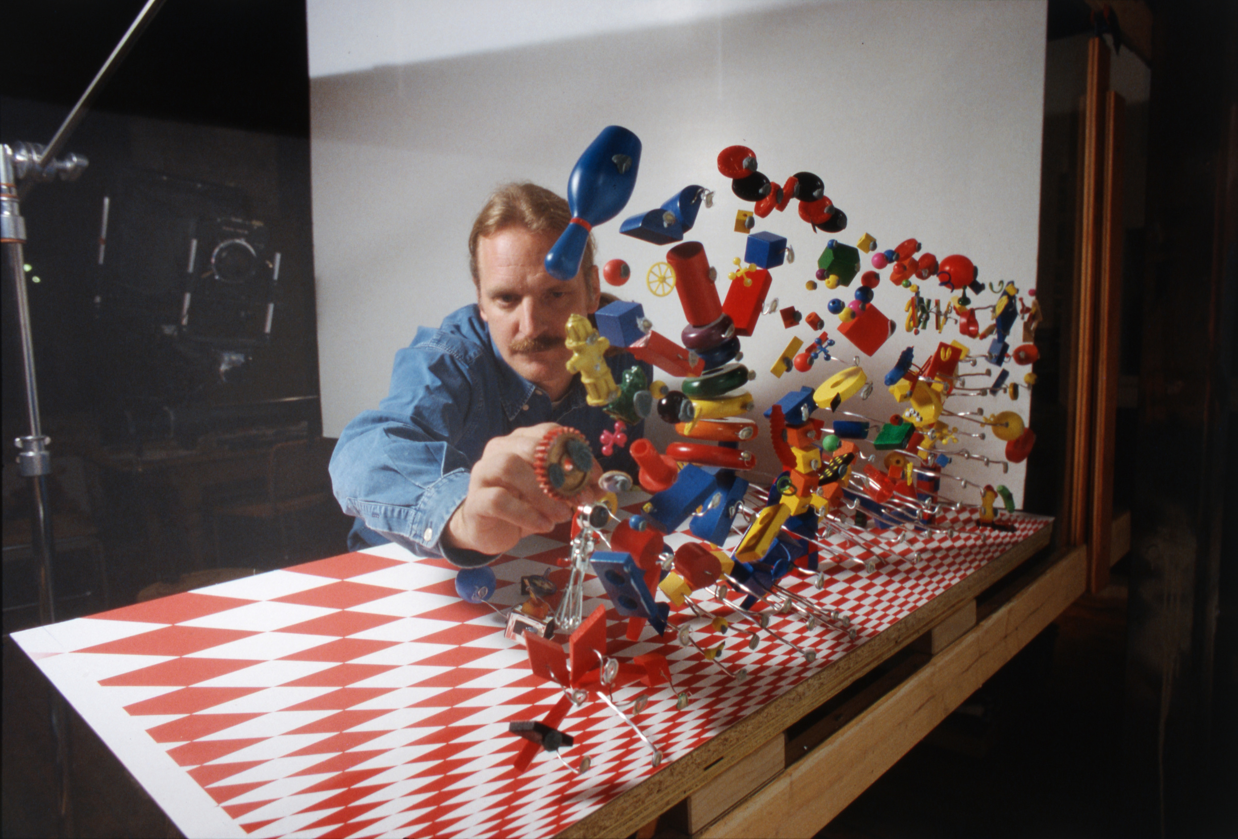
On set of Yikes! , 1993
Above, you can see the set from the back of the glass, the camera is behind me to the left. Some objects could be attached directly to the glass, others were mounted on aluminum armature wire so I could play with their relationships in 3D space. A mix of small and large objects were chosen to further the illusion of depth. Naturally, I was quite constricted by this set up, having to work out the composition while keeping each object's glue or wire support in a narrow blind spot behind each object. Moving the camera left or right even just an inch would have exposed the hidden supports. A large white screen provided the backdrop to the primary colored props, and canceled out reflections in the glass due to its brightness.
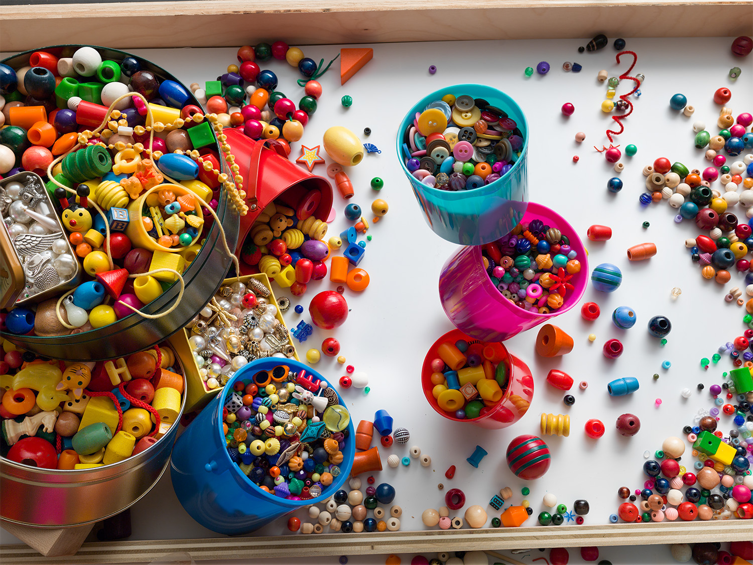
On set of Toppled, 2013
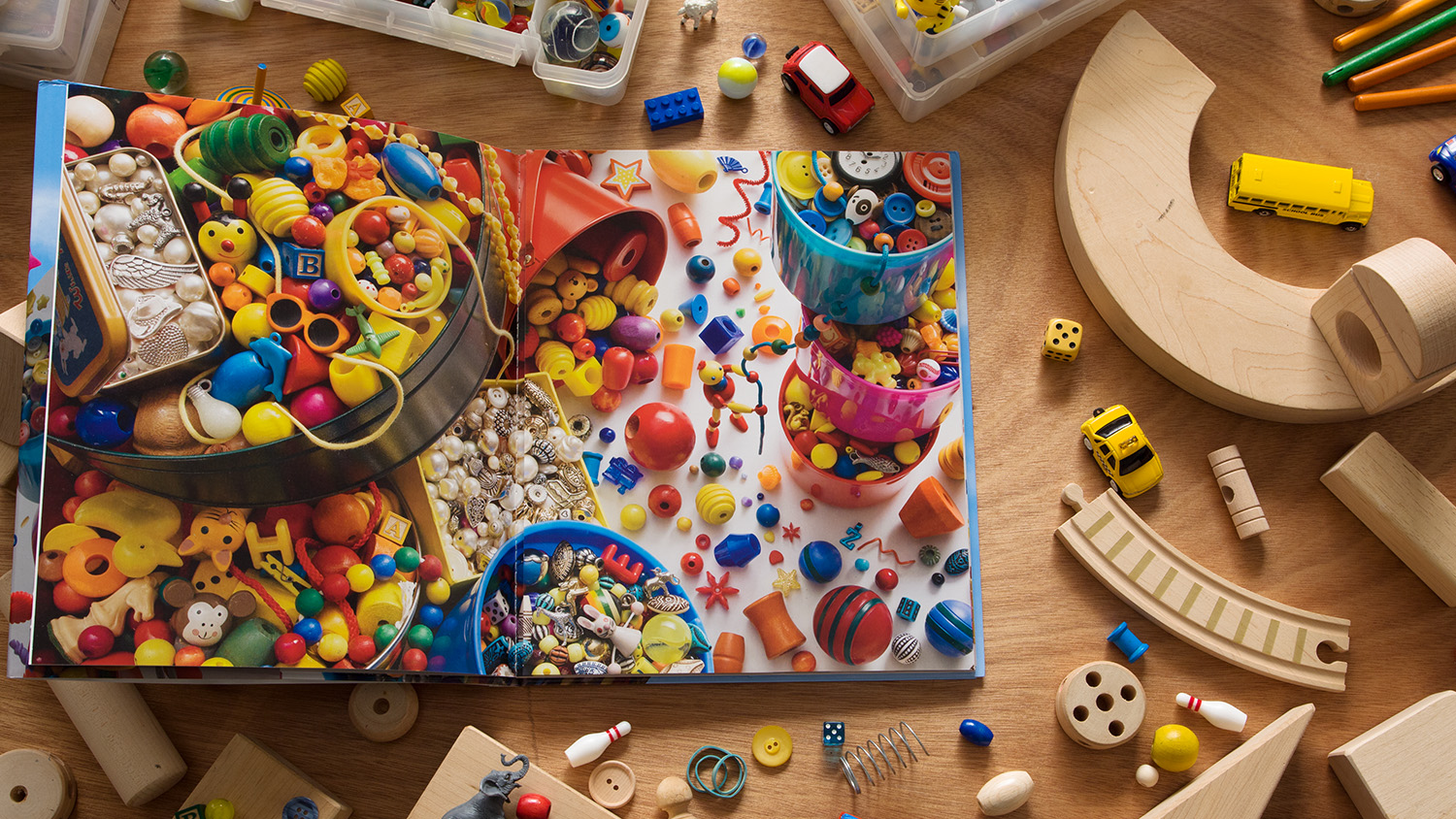
Fast forward 20 years later. Toppled is a two part sequence: stacks of overstuffed containers in the first scene, everything flying apart in the next. The first photo is an ordinary still life requiring no cut-and-paste Photoshop tricks. However, even with straight still life, shooting digitally has many advantages. I can look at a live view of what my camera is seeing as I arrange the set-up, saving frequent trips up and down a ladder to look through the camera; there's no more Polaroid or film processing (and related expenses) to contend with; I can forensically examine the digital files at any step of the way with a push of a button. And best of all, I can achieve the deep focus required of my images through a process called "focus stacking," a computer process that stitches together the sharpest parts of images shot at different focus points into one seamless whole. No forced perspective set-building necessary.
Toppled (part 1) ©2015 Walter Wick
Arranging props in a scene such as this is a joy. With gravity on my side, everything at arms length and no arduous physical conditions constricting me, I can go for hours at a clip, sculpting piles of stuff into a landscape of intersecting shape, form and color until my eye wanders endlessly among the details. In such conditions, how the image is captured has little bearing on the success of the arrangement – though the time-saving work flow enabled by digital preview, capture and post processing, certainly helps.
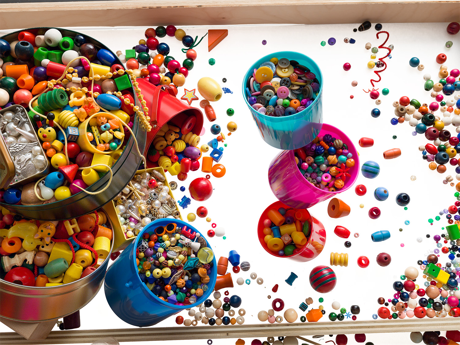
For the second part of the sequence, I tilted the three central containers precariously and exaggerated the distance between them using hidden supports to hold them in place. Next, I shined a light from underneath the glass table top, illuminating the thin white plastic sheet that covered the glass (click on picture above to turn on and off backlight). This set up was the basis for the second part of the sequence and for photographing subsequent groupings of loose objects which were later composited together in Photoshop to complete Toppled.
So, is it easier now? In so many ways, yes. Then again, with every task made easier, a new challenge beckons. With its 29" fold-out sequence and multi-element composition, Toppled was every bit as time consuming and intricate as Yikes!
But while I now have digital age tools to make things "easier", I also now have digital age readers brought up in an effects saturated age. With that in mind, for Toppled, I endeavored to provide readers with something more to observe; something more to think about: in they act of opening the flap, it's they who activate the perceptual change from solid surface to free fall. Thus, with the cause and effect close at hand, the emphasis can shift from the mechanics of behind-the-scenes rigging, to the mechanics of seeing – and the very nature of illusions.
Many thanks to the fan who inspired this post.
